I am an art director and graphic designer in Ann Arbor, Michigan. When I’m done fulfilling my nine-to-five responsibilities I often spend my free time drawing.
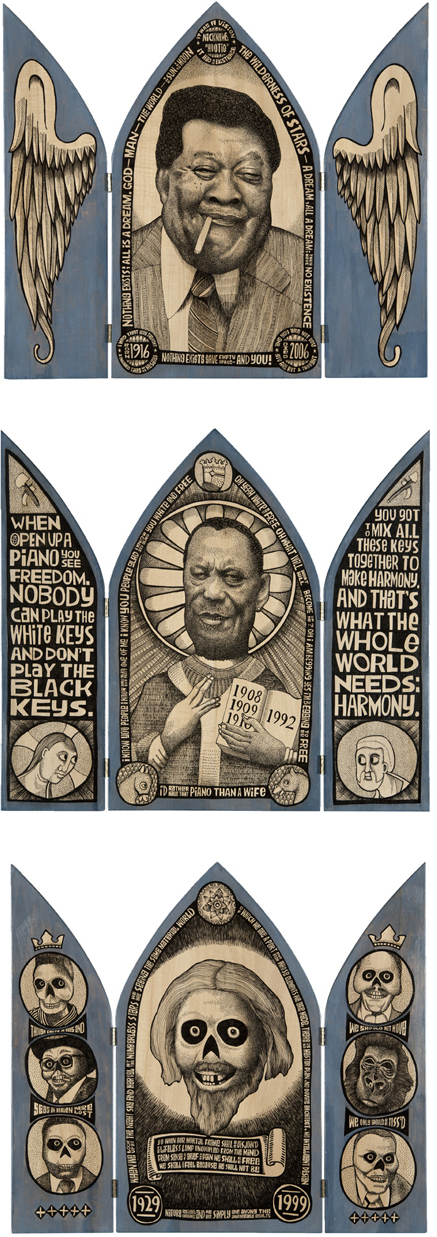
In the spring of 2010 I got to know blues and boogie pianist Mark Braun (Mr.B). Our friendship lead to a project that combined Mark’s music and my drawings. Using a Tombow Zoom pen, I drew portraits of sixteen blues and boogie woogie piano legends that had influenced Mark’s playing style and career, some of which he knew personally.
We crafted hinged panels of basswood for each of the bluesmen, a format that wouldn’t need to be framed. To keep the text and images spontaneous and free, no “under drawing” was done. In fact, very little planning or preparation were done before the drawing began.
That can be considered playful, or stupid, depending on one’s perspective. For me, it was probably a reaction to the rigors of my day-to-day art direction and graphic design responsibilities that come with an army of account executives, copywriters, creative directors and clients all pitching in with strategies, objectives, graphic standards, and feedback that can range from the helpful to the puzzling. With this process I simply sat down with some basic reference material and got after as best I could.
Eventually the project came to fruition at Ann Arbor’s Kerrytown Concert House in February of 2012. Mark performed and told stories relating to the musicians portrayed on the artwork displayed in the concert house. In addition, the work has been shown at the Antieau Gallery in New Orleans.
John Pappas is a Michigan-based art director and designer. We invited him to share a moment of play with us.