The Deutsche Plakat Museum, Museum Folkwang, Essen recently accessioned a whopping forty-nine of my posters. This includes not only work from BlackDog and Design is Play—co-designed with Angie—but also the first poster I ever designed while still in college at UCLA in 1984.
Three photos from the Museum Folkwang show some of the posters as they are being unpacked: 1) “Moloch (Capitalism Consuming His Children)” is from 1997; 2) “Tolerance” was designed by Angie and me (with lettering by John Stevens) in 2008; 3) “Republican Contract on America” is from 1995.
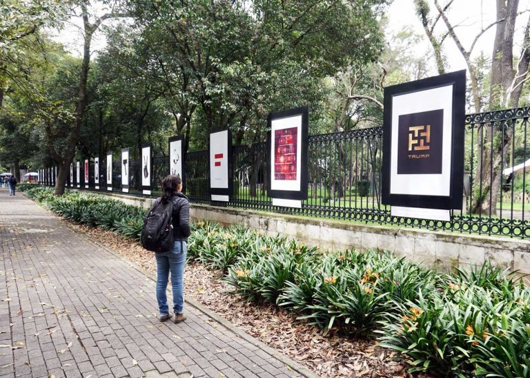
Nearly all of the posters were designed as self-initiated projects or pro bono. I am honored and humbled that my work over the last forty years continues to resonate. [MF]

 We are honored to be a part of the Letterform Archive’s